Menü
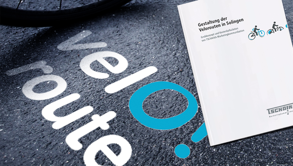
The expansion of a cycle route system is intended to upgrade the cycle infrastructure and increase the low proportion of cycle traffic by marketing the service.
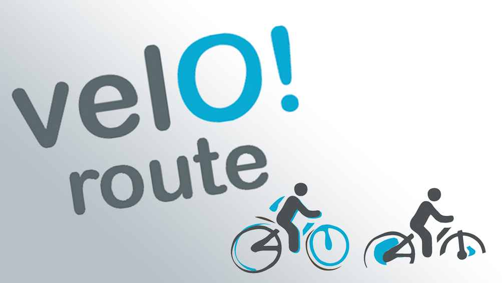
The start of the design concept for the new cycle route is the illustrative approach of the logo and word mark. The focus is on values such as individuality and the joy of cycling.
The word mark, which can also stand on its own, is set in two lines, with "Velo" emphasised by the larger font.
In addition, the O is highlighted in colour because it has the shape of a circle/wheel on the one hand and is associated with the positive interjection "OH!" as a single letter in conjunction with the exclamation mark on the other. At the same time the exclamation mark is understood as a simple and catchy invitation to cycle.